The web design industry never stands still and with each passing year, fresh trends emerge giving us new ways to captivate online audiences.
Staying in tune with the latest web design trends isn’t just about keeping your site fresh and stylish. It’s about creating an experience that resonates with today’s user.
The emphasis on user experience is stronger than ever. Online visitors are looking for websites that aren’t just pretty, but also intuitive and user-friendly.
By keeping your website up-to-date, you’re not just showing off a modern aesthetic. You’re telling your visitors that you understand what they’re looking for.
Custom Illustrations
In 2026, custom illustrations are set to be a defining trend in web design. As brands strive to create unique and memorable experiences, bespoke illustrations offer a distinctive way to stand out.
Unlike stock images, custom illustrations are tailored to reflect a brand’s identity and message. They can be whimsical, sophisticated or anything in between, depending on the tone you want to convey.
This level of personalisation helps create a stronger connection with your audience, making your website more engaging and relatable.
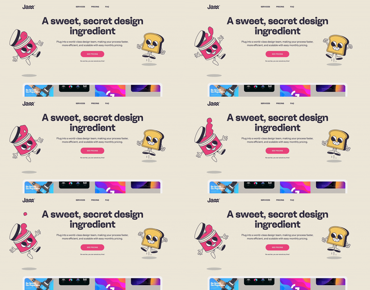
Custom illustrations provide several advantages. Firstly, they enhance the visual appeal of your site, making it more attractive and inviting.
Secondly, they can simplify complex ideas and data, turning intricate concepts into easily digestible visuals. This is particularly useful for industries that rely heavily on data or technical information.
Custom illustrations can also be used to strategically guide users through your website, highlighting key areas or calls-to-action.
They add a layer of creativity and innovation, showing visitors that your brand is invested in delivering a unique experience.
Incorporating custom illustrations also improves your website SEO. Visual content can keep users on your page longer, reducing bounce rates and boosting engagement metrics.
Search engines notice these positive user behaviours, which can enhance your site’s ranking.
Creating high-quality custom illustrations requires collaboration between designers and digital marketing teams to ensure the visuals align with the overall brand strategy. Tools like Adobe Illustrator and Procreate are popular choices for crafting these bespoke visuals.
3D Web Design
Whether it’s rotating a product or interacting with an object from multiple angles, 3D web design transforms a website visit into an experience.
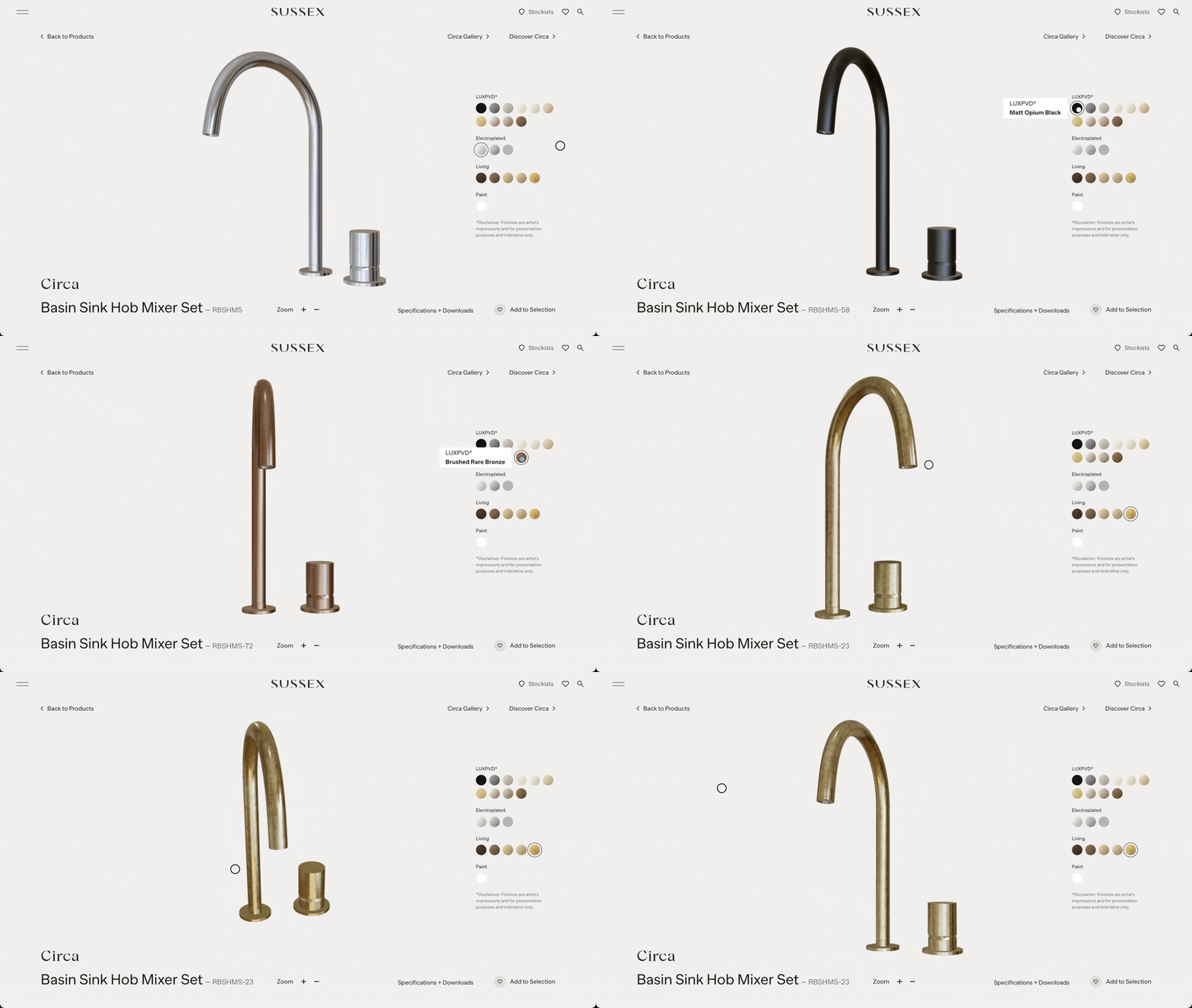
Unlike traditional website designs built on standard grids, 3D design introduces the illusion of space.
When implemented well, they help users understand products, navigate content and stay engaged for longer.
Whether it’s for an eCommerce store or a landing page, 3D design creates a layer of immersion that flat visuals simply can’t match.
AI Chatbots
AI chatbots have become an essential feature in modern web design, offering a seamless way to engage with users.
The integration of chatbots continues to evolve in 2026, providing more personalised and efficient user interactions.
AI chatbots are designed to mimic human conversation, providing instant responses to user queries.
They help businesses offer 24/7 customer support, guiding visitors through the site, answering questions and even assisting with purchases.
This level of accessibility enhances the user experience, making visitors feel valued and understood.
One of the significant advantages of AI chatbots is their ability to handle multiple interactions simultaneously without compromising on the quality of engagement.
This efficiency not only improves customer satisfaction but also frees up human resources for more complex tasks.
Additionally, AI chatbots can gather valuable data from user interactions, helping businesses understand customer needs and preferences better.
This data can be used to optimise content, improve services and tailor marketing strategies, leading to higher conversion rates.
Dynamic Cursors
Dynamic cursors are an emerging web design trend, adding a unique interactive element to the user experience.
This feature is becoming more popular this year for its ability to make websites feel more engaging and responsive.
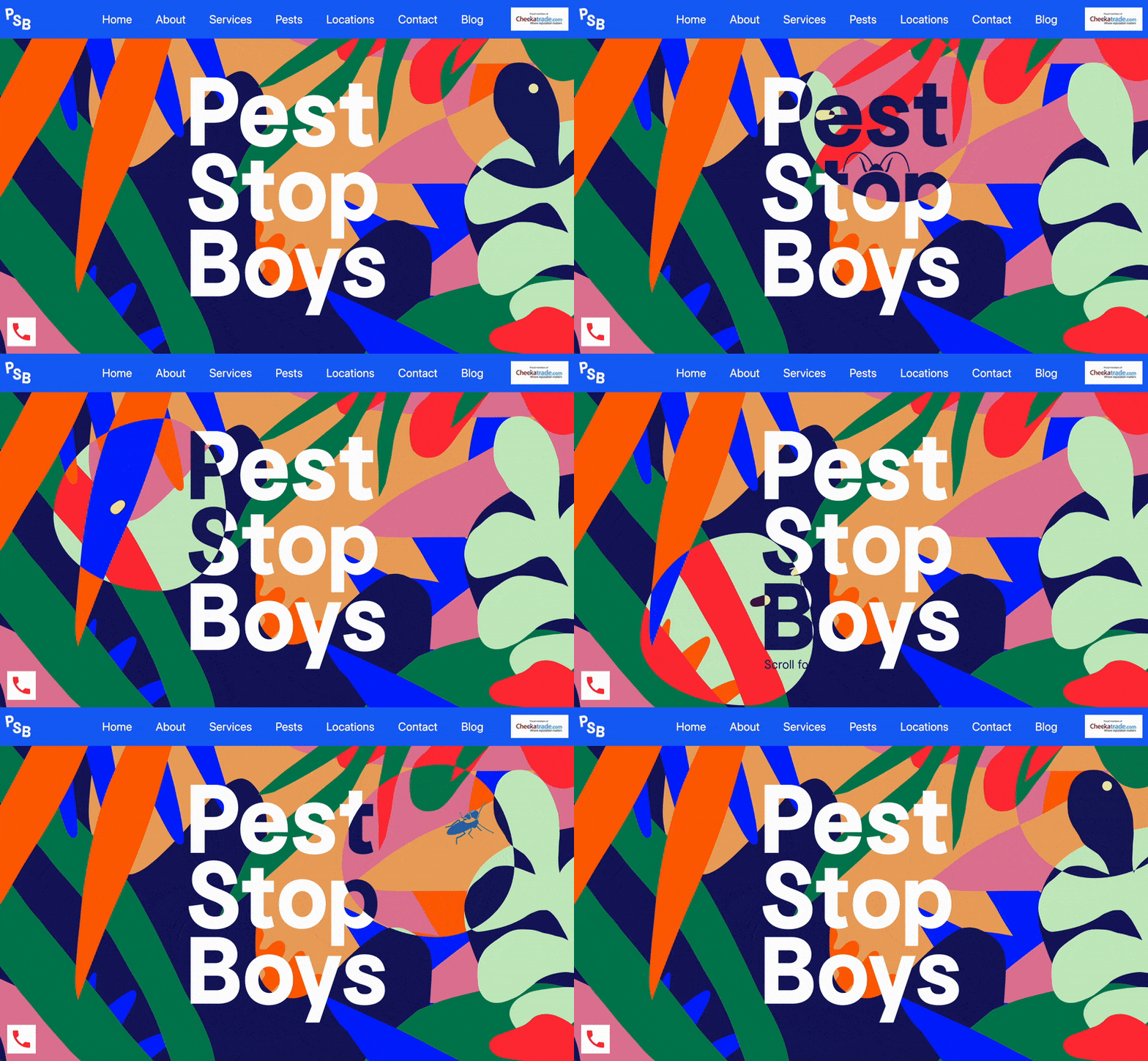
Dynamic cursors change appearance or behaviour based on user interaction.
For example, the cursor might transform into a different icon when hovering over a link or follow a custom path when moving across the screen. These subtle changes can make navigation more intuitive and enjoyable.
One of the primary benefits of dynamic cursors is their ability to guide users through the site. By changing form or animation, they provide visual cues that enhance usability.
This can help users understand where to click, what to focus on or how to interact with different elements on the page.
Dynamic cursors also contribute to a website’s overall aesthetic. They can be designed to match the site’s theme, adding a layer of cohesion and professionalism.
Customising the cursor to align with your brand’s identity can create a memorable and unique user experience.
However, it’s essential to use dynamic cursors carefully. Overdoing it can lead to a cluttered and distracting interface.
The key is to keep the effects subtle and purposeful, enhancing the user experience without overwhelming it.
Organic Shapes
Organic shapes are irregular and asymmetrical, resembling forms found in nature. These shapes can be used in various elements of web design, such as backgrounds, buttons and illustrations.
By incorporating organic shapes, designers can create a more fluid and dynamic visual experience that stands out from the typical grid-based layouts.
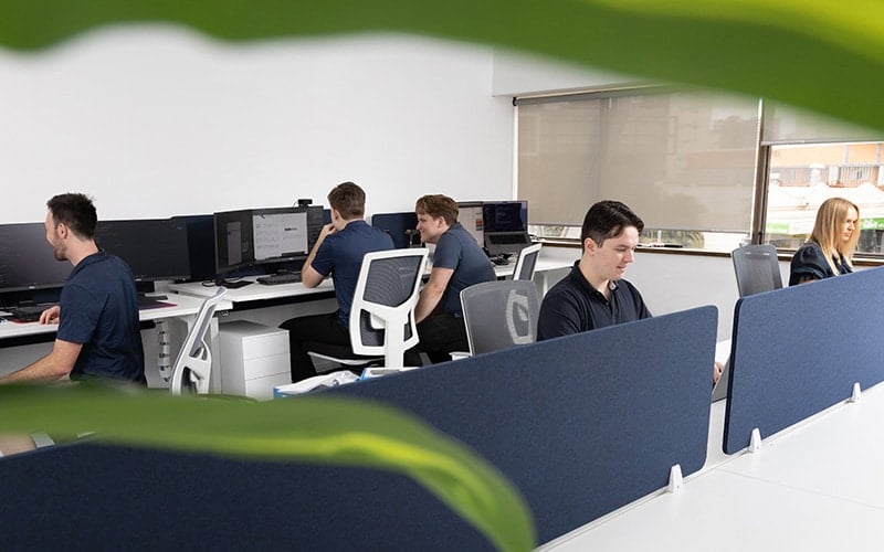
One of the key benefits of using organic shapes is the ability to create a more relaxed and inviting atmosphere.
These shapes can soften the overall look of a website, making it feel more approachable and user-friendly. This is particularly effective for brands that want to convey a sense of warmth and personality.
Organic shapes also help in breaking up monotonous layouts, providing visual interest and guiding the user’s attention to specific areas of the page.
They can be used to highlight important content, create movement and enhance the flow of the design. This results in a more engaging and enjoyable user experience.
Implementing organic shapes in web design requires a balance between creativity and functionality. It’s important to ensure that these shapes do not interfere with the usability of the site.
Instead, they should complement the overall design and enhance the user’s journey.
Full-Page Headers
Full-page headers have become a prominent feature in web design, creating an immediate visual impact as soon as visitors land on your site.
This design trend will continue to dominate in 2026, offering a powerful way to captivate your audience from the get-go.
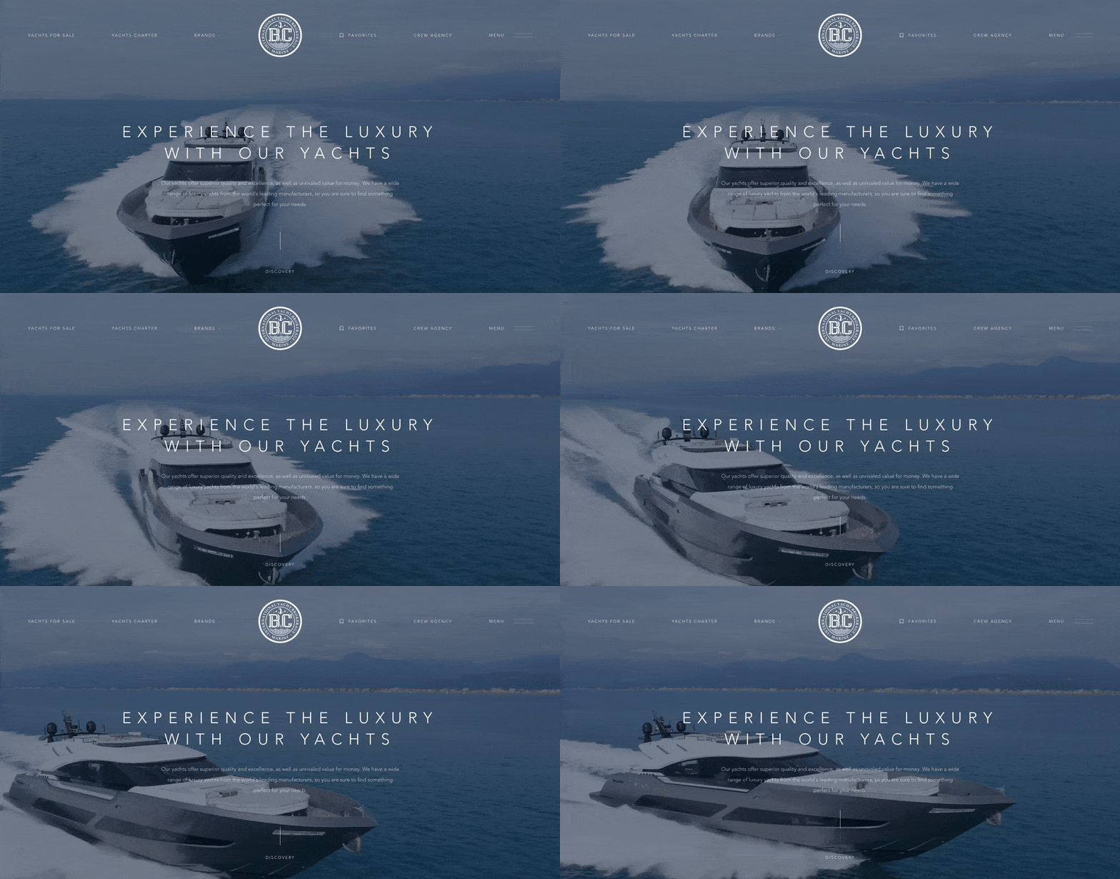
A full-page header, often referred to as a hero section, occupies the entire screen and serves as the first point of interaction between the user and the website.
This approach allows you to showcase stunning visuals, compelling copy and strong calls-to-action that set the tone for the rest of the site.
The primary advantage of full-page headers is their ability to grab attention instantly. They eliminate distractions, directing the user’s focus to the most important message or visual.
Whether it’s a high-quality image, a promotional video or an engaging headline a full-page header ensures that your key content gets noticed.
Full-page headers also enhance storytelling. By using bold visuals and concise text, you can convey your brand’s story and values right from the start.
This immersive experience helps in building an emotional connection with your audience, making them more likely to explore further.
Micro-Interactions
Micro-interactions have become a powerful tool for engaging, delighting and retaining website visitors.
These subtle design details occur following a user’s specific action on a website, such as the gentle shake of a password box when the wrong login details are entered or the animation of a like button when clicked.
While they may seem trivial, micro-interactions play a crucial role in shaping the user’s journey. They provide real-time feedback to users, guide their actions and often add a layer of fun or engagement to otherwise mundane tasks.
As brands strive to differentiate themselves in a crowded online world, these subtle design elements can make a website stand out.
With user attention spans dwindling, the immediate feedback provided by micro-interactions keeps users engaged and decreases bounce rates.
Designing impactful micro-interactions requires a balance between creativity and purpose.
Dark Mode
One trend that’s been shining bright (or perhaps, dimming) in recent years is dark mode.
It’s no longer just a passing trend in the web design playbook but an integral feature many users have come to expect.
The appeal of dark mode isn’t just aesthetic, it can be incredibly practical. By providing a high contrast between text and background, dark mode can drastically reduce eye strain, especially in low-light conditions or during nighttime browsing sessions.
There’s a significant energy-saving aspect tied to dark mode, especially on OLED screens. When pixels are black or turned off they consume less power which leads to longer battery life on mobile devices and laptops.
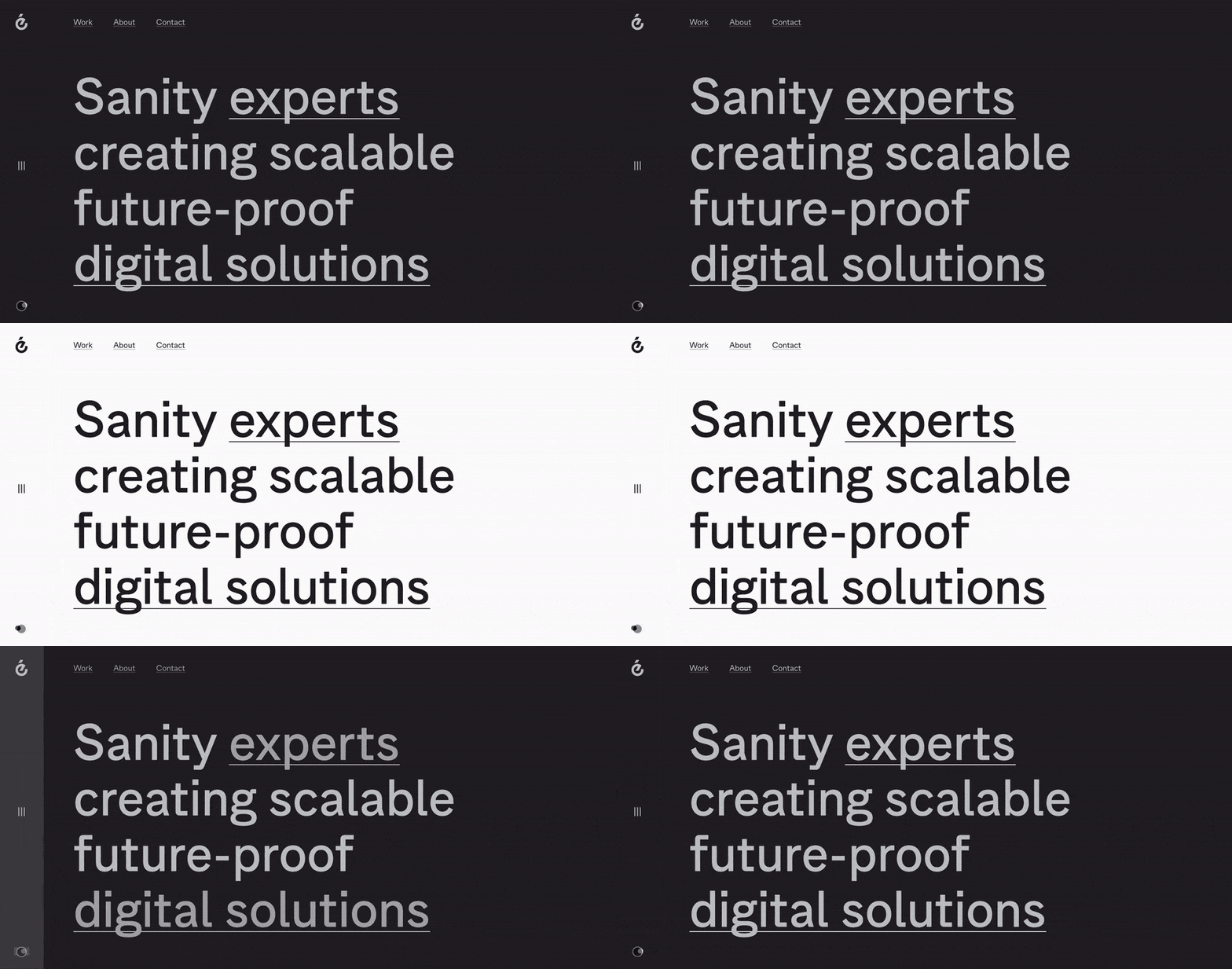
Implementing dark mode isn’t just about flipping the colours around. For it to be effective, designers have to consider various elements – ensuring the visual hierarchy remains intact, icons and images are optimally visible and the overall user experience is enhanced.
Many brands are going beyond a simple black background, playing with various shades and colour palettes to give their dark mode a unique signature touch. This not only adds to brand identity but also ensures the design remains engaging.
Integrating a solution to toggle between both dark and light themes on a website is also extremely popular.
Web developers are capitalising on the system preferences of modern devices to automatically detect and align this option with a user’s preferred theme, offering an intuitive and tailored browsing experience.
White Space
White space refers to the empty areas between elements on a page. It might seem like wasted space, but it significantly enhances the visual hierarchy and overall user experience.
By giving content room to breathe, white space helps to focus attention on key elements and makes the site easier to navigate.
One of the primary benefits of white space is improved readability. Text and images are more accessible when surrounded by ample space, reducing clutter and making the content more digestible.
This is particularly important for mobile users, who benefit from a clean and uncluttered interface.
White space also contributes to a more sophisticated and modern aesthetic. It can make a website appear more polished and professional, enhancing the overall perception of your brand.
By using white space effectively, you can create a balanced and harmonious layout that draws users in and keeps them engaged.
Additionally, white space can improve user interaction by making clickable elements, like buttons and links, more distinguishable.
This enhances the usability of your site, leading to better user experiences and increased engagement.
When designing a website with white space, it’s important to strike a balance. Too much empty space can make a site feel sparse and unfinished, while too little can lead to a cluttered and overwhelming experience.
The goal is to use white space to guide the user’s eye, highlight important content and create a sense of openness and clarity.
Parallax Scrolling
Parallax scrolling involves background images moving slower than the foreground content as the user scrolls down the page.
This creates an illusion of depth and a sense of motion, making the website feel more interactive and engaging.
It’s an effective way to tell a story, guiding visitors through content in a visually appealing manner.
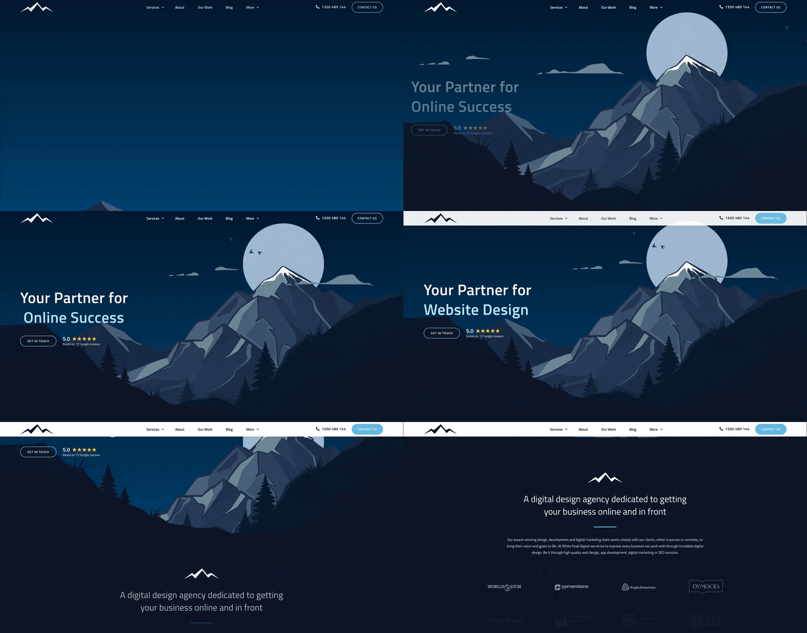
The appeal of parallax scrolling lies in its ability to make a website stand out. By incorporating this technique, you can create a memorable user experience that keeps visitors engaged longer.
It’s particularly useful for storytelling, product showcases and landing pages where visual impact is crucial.
To effectively implement parallax scrolling, it’s important to balance creativity with usability. Overusing the effect can overwhelm users and slow down your site.
Ensure that the design is responsive and performs well on all devices, including mobile phones and tablets.
Keep the animations smooth and subtle to enhance the experience without distracting from the content.
Colour Trends
Colour trends in web design continue to evolve rapidly from year to year, bringing fresh palettes and innovative combinations that can transform the look and feel of websites.
One of the standout colour design trends is the use of bold and vibrant colours. Bright, eye-catching hues can create a strong visual impact and convey energy and excitement.
These colours can be used strategically to highlight important elements, draw attention to calls-to-action and create a memorable user experience.

In contrast, soft pastels are also gaining popularity. These gentle, muted tones offer a calming and sophisticated aesthetic, making them ideal for brands looking to convey tranquillity and elegance.
Pastels work well in minimalist designs, providing a subtle yet impactful visual appeal.
Another emerging trend is the use of gradients. Gradients add depth and dimension to flat designs, creating a sense of movement and fluidity.
They can be used as backgrounds, overlays or to add a modern touch to various elements of a website. Multi-coloured gradients can create a dynamic and visually engaging effect.
Monochromatic schemes are also trending, offering a cohesive and harmonious look.
By using different shades of a single colour, designers can create a sophisticated and unified design that is easy on the eyes. This approach works well for brands looking to maintain a clean and professional image.
Incorporating these colour trends into your web design requires a thoughtful approach. It’s important to consider your brand identity, target audience and the overall user experience.
By experimenting with different palettes and combinations, you can find the perfect balance that enhances your site’s visual appeal and effectiveness.
Final Thoughts
Staying ahead of web design trends is crucial for creating engaging, user-friendly and visually appealing websites.
From mobile-first design and micro-interactions to dark mode and AI chatbots, these trends offer innovative ways to enhance user experience and differentiate your brand.
Incorporating custom illustrations, full-page headers, parallax scrolling, dynamic cursors, white space, organic shapes and the latest colour trends will ensure your site remains fresh and captivating.
By embracing these trends, you can create a modern, responsive and memorable website that resonates with your audience and drives business success.
Are you looking for help with your next web design project? Our team builds websites for clients all over Australia, including Brisbane, Sydney, Melbourne, Adelaide, Perth, Hobart, Canberra, Gold Coast and the Sunshine Coast.
Frequently Asked Questions
Why are micro-interactions important?
Micro-interactions provide real-time feedback to users and add a layer of engagement. They enhance the user experience by making interactions more intuitive and enjoyable.
How does dark mode benefit users?
Dark mode reduces eye strain in low-light conditions and can save battery life on devices with OLED screens. It also offers a sleek, modern aesthetic that many users prefer.
How can custom illustrations enhance my website?
Custom illustrations add a unique and personal touch to your website, reflecting your brand’s identity. They can simplify complex ideas and make your site more visually appealing to help guide users through your content.
What is parallax scrolling?
Parallax scrolling is a web design trend where background images move slower than the foreground content, creating an illusion of depth and motion.
How can I effectively use white space in web design?
White space improves readability, reduces clutter and enhances the visual hierarchy of a website. It helps focus attention on key elements and creates a clean aesthetic.
To your success,
Jackson
